%20copy.png)
 |  |  |
|---|---|---|
 |  |  |
 |  |  |
GOKOOL PURE VEG
Pure Veg Family Restaurant At Camp, Pune
 |  |  |
|---|---|---|
 |  |  |
 |  |  |
 |  |  |
TEJASWINI MAKEUP STUDIO
Type: Commercial Makeup-studio
Status: Built
Budget: Undisclosed
Area: 800 sq.ft.
Year: 2018
Design Team - Prashant Kulshreshtha, Urvija Kriti
Photography By – Vignete photo studio
Description by – Tanvi Kulshreshtha & Urvija Kriti
Located in the city's Baner area, a makeup studio 'Evoke’ is where customers enjoy promised beauty & makeup services in a dreamy fairy tail set-up.
By taking some extra measures to create a particularly attractive salon, we aimed to substantially increase its ability to attract and maintain clientele.
Designed considering numerous factors including the customer persona & lifestyle, owner’s expectations, space limit, budget & the most important one “Exclusivity & uniqueness” - we are more than happy with how it has turned out fulfilling all the aspects.
"We were reforming the original meaning of the word ‘Makeup Studio’, as a social and experiential hub,"
"It's a place people could come not just for the expert services offered but to feel rejuvenated, more confident & satisfied.” - Project designer Prashant Kulshreshtha.
The furniture, the subtle colour scheme and the lighting has been chosen in such a way that it sets a soothing & ‘Not so typical salon like’ experience.A successful theme should convey a specific image that is memorable to clients and leaves them with positive feelings about the place services.
The ambition was to create a distinctive framework that puts the spotlight equally on the customers as well as on the workers and their working stations, without compromising on the spaces and functionality.
The design process began with understanding & creating floor plan for the necessary furniture required, equipment positions, flow of customers and staff & the optimal spaces essential to work freely without being ‘chaotic or disorganized.’ Since salon patrons spend a lot of time sitting and waiting and often bring friends who may not need services, we also kept that space requirement in mind.
Wooden flooring has been chosen for a more contemporary approach, while the walls were painted in white to create a neutral backdrop with a golden touch. Every area flows seamlessly into the next one, while maintaining the privacy.
White was used as a resource to a ‘High end vibe’ and luminosity. A simple colour palette of white and gold mixed with glass accents created a gorgeous base. We settled for this colour scheme so that the environment would be calm delivering a message that ‘This is a place that welcomes customers and assures them of that it understands ‘beauty.’
Entire furniture is finished with Duco & white satin finish with a ‘Queenly’ aura while adding desired glamour to the space. As ‘makeup’ is an art & the place must convey it through the ambience we decided to go with an artistic mindset particularly when it came to the ceiling. And honestly this is our favorite part. Horizontal flat ceiling would have been too ordinary hence we experimented with flexible ply curved bands painted in white satin finish adding the ultimate component to our vision.
A chandelier as a central light source added to the exquisite ceiling created a sparkling vibrant flavour, making the place exemplary for all the chirpy, exciting & joyous interactions with customers. The way the design has turned out we are sure the customers will be fond of the place not just for the quality services but the wholesome experience they had.
 |  |  |
|---|---|---|
 |  |  |
 |
VENTURIT GLOBAL OFFICE
Type: Commercial Office Space Status: Built
Year: Dec 2016
Budget: Undisclos
Area: 1800 sq.ft.
Year: 2018
Design Team - Prashant Kulshreshtha, Urvija Kriti, Akanksha Walse, Ankita Pashankar
Photography By – Ajay Belsare and Sneha Rodha
Text by – Urvija Kriti & Tanvi Kulshreshtha
Considering the significant time spent in office and innovation based work of modern times the primary focus for a new age office design shifts from an orthodox, cubicle set -up to a more playful, open & relaxed or in other words a “practical” one.
No visual clutter at office space is excellent for unleashing employee’s creative side providing a calm, distraction free atmosphere enhancing the productivity quotient multiple folds as a byproduct.
We decided to achieve the desired by staying Monochromatic - ‘white & shades of grey’ - with a sober selection of modern satin finish materials including Duco, PU & solid wood.
‘White’ color helped us in creating a refreshing, airy & quite ambiance while the ‘grey’ successfully gave a ‘formality’ that is subtle & elegant without being too conservative. Both the colors complement each other & communicate the underlying sentiments throughout the space & encourage staffers due to the welcoming & positive vibe.
To fulfill all the requirements & purposes, the substantial plan space on the top most floor of the building was segregated into three zones.
The first space right next to the main entry is a war room, consists of meeting & conference zones. This space feels more lounge like than an office cubicle. The reason behind this was to create an ideal place for brainstorming & discussions.
The conference room is equipped with a large wooden table made of Australian solid wood pine polished with transparent epoxy coating. For the ceiling of the same room an ‘origami inspired, fabric finish, metal’ false ceiling was chosen which also features acoustical properties.
The ceiling is ornamented with hanging filament bulbs. Bright red color for the ceiling is in complete synergy with bright red bar counter & bench placed at the extreme end of the office. Also, the red adds a burst of color to the otherwise monochrome interior. The room is partitioned with frosted glass walls.
The second zone has an open, wide & commodious central working space with sleek working desks designed to fit in all requirements. The objective was to present a trendy, alternative design aesthetic for this modern organization so we chose to go with “Industrial quality with honest materials” which is the new “Brave, Bold & Organic.”
Following the same the ceiling ducts were left exposed & painted in dark color.
To soften & open -up the space like never before we have used “White” for the walls & furniture both.
Following the color & style theme, the floor is covered with a slate grey carpet with some area left exposing the cement mosaic tile underneath to the raw feel.
The last zone is ‘Leisure space” ideal for recreational activities. Staffers can either carve personal space for work or just de-stress & loosen-up in this luxuriate space.
This space consists of a bar table which is utilized for storage and also during the time off to have those much required “fun breaks”.
The sequence of dangling filament bulbs over the unit, produces a sparkling, radiant & vibrant aura making entry at the far end more welcoming. Behind the bar-counter “Bench seating” is made available, along the wall, stealing some extra sitting capacity. Side niche are utilized as efficient storage spaces.
The overall work space design in India is going to another level where Venturit global India office is our effort to start another discussion of casual spaces. We hope the monotony of corporate interiors escalates another ladder of design in upcoming days, hence we can experience different side of work space design.
 |  |  |
|---|---|---|
 |  |  |
 |  |  |
 |  |
TRAVELERS RESTAURANT, WAKAD
Status: Built
Year: Dec 2016
Budget: Undisclosed
Photos: Vignett Studio Design Team: Prashant Kulshreshtha Etisha Jain Priyansh Sharma
Story: The constant development of hospitality in the world wrt design and presentation has been generating a lot of interest to young generation. This generation is outgoing, energetic and explorer. Giving the emerging tradition to rediscover the world and surroundings, The concept of @onfire Restaurant was devised. Being on terrace, away from hustle and burden of everyday life, engulfed in surrounding view and cool breeze, the place was planned to take and inspire to go to the road less traveled. The initial stage of project consist of a series of ideas, ranging from ordering the ‘empty’ terrace, zoning the usable areas and answering the most detailed parts of planning and design. The first thing to do is to reach the empty approaching staircase which is adorned with famous travelers and photos of travel bloggers against a yellow wall. Filament bulbs is used to highlight the place with amber colour in contrast to sapphire blue walls whereas wooden strips climb along the wall to ceiling making the place a bit dynamic.
While the entrance lobby is planned with two single pine sofas (designed with the overall cross feature of wood design in the project) one two seater steel sofa with red cushion is placed to mark the comfort. One metal ceiling metallic yellow element with intact light was created at site to highlight the entry to the restaurant. In making the most of the design, contribution by our clients is appreciable. Right from time to time approvals over the planning and details to the funding everything were smoothest of all. The entrance lobby is nestled behind a yellow dynamically designed coffee table book shelf. The books are about the most exciting places to visit. This shelf also work as showrack where few curios are put to mention the eagerness of travelling.
While you entreing the restaurant you will be amazed with world map made by Ogling inches team on raw finish brick wall with tilting pattern. The four zone timing can be observed at the top of the wall with four yellow and white clocks against the Dior grey wall. Two wooden block shelf with internal lights divide the bar to the lobby. After entering the seating floor, you will be mesmerized to see the wall cladded with green natural plantation and creepers, country flags and framed images of particular country, and central buffet counter with jaali work and green court. The buffet counter is highlighted with cement jaalis specially purchased for counters (bar and buffet), these jaalis also have lighting behind them, making the place unusually beautiful in night. Service counters are placed at the four corners in Scandinavian style. Side seating is planned with sofas at one side and chairs on the other.
The chairs are specifically designed and fabricated to suit the overall ambience of jaalis. Presenting a warm and inviting element, the cabanas are next element which is featured. The cabanas are specially planned with a step up, in the end of the restaurant for the visitor’s vision while entering the space. These four cabanas are divided into pair of two, where each pair is comprised of cane seating and another of metal seating. It was never the intention of owner to fill the place with the seating hence the beauty of the overall carpet area has come out well. Washrooms are tucked away in the corner of the plan besides which 1200 sq. ft. Of kitchen is placed. The elegance of the plan can be measured with the non visibility of the huge service areas to the customers. While enjoying the meals they don’t see a hint of kitchen and washrooms while signage helps them to explore these places well. Overall, The restaurant has come out to be the most featured commercial design around, inspired by various cultures, architecture and material use. We hope this project changes the upcoming trend of restaurant designs in India.
 |  |  |
|---|---|---|
 |  |  |
 |
BBQ ONFIRE RESTAURANT
Design Team - Prashant Kulshreshthaa, Akanksha Walse, Urvija Kriti
Photography - Sonam Kesarkar
Type- Commercial
Status- built
Location- Pune , Maharashtra Year-2017
No. Of days- 50 Days
After successfully designing, execution and doing business, I Remember an evening with one of the partners of the now so famous Onfire restaurant. He was eager to open another restaurant aiming to quench Pune food lover’s thirst. As the evening changed to night we concluded this beautiful location at World trade Centre, Kharadi, Pune. And why not?? young crowd, food enthusiasts, corporate firms and so many other reasons. This was the place any successful restaurant owner wish to have a square feet of bussiness in! And Hence our inquisitive design story started, to provide this crowd an overwhelming ambience in addition to comfort.
A restaurant is built to cater to the taste buds of the mass. The concept of a restaurant design is not just building it but its a conceived notion to lure individuals into the space, to the table and to the food! This project for us was all about tackling the sources behind thriving restaurants understanding the secret to a full house restaurant and tapping the senses right. Colour- Thought the base colour of the restaurant is grey a pop of warm colours are used throughout to stimulate hunger, with an addition of blue tints to the space which will help in a carefree and calming feel. Smell - The restaurant being a barbeque and grill serving place, taking advantage of that the layout of the space was done such that the customers can sense the aroma and which eventually triggers the sense of hunger.
Lighting - Light creates ambience and feel of the place, a lot of attention was put into illuminating the space. A combination of various types of lights is used in the space to reflect the needed kind of ambience. Hanging Lights with glass finish, metal lamps with powder coated structure and filament bulbs, spot lights to highlight the stories behind the travel theory. The main buffet area is highlighted with the various kinds of filament bulbs. Acoustics - Being a family restaurant soft music playing in the background will make the customers comfortable for the dining experience also making sure that their conversations with the fellow diners cannot be heard at the next table.
Decor- Being another travel story teller place, the walls has a lot of framed travel destination posters. Which keeps you poking while you eat your morsel! Additionally World map in copper wire showcase the main theme of the restaurant. Miniature modes of transport and a Horn at the entry have made customers go crazy after enjoying their Delicious food. The part where you design the interior is not only for looks but practicality too. The diners need to see and be seen by the staff making it easier for the whole process. As far as looks and ambience is considered in On fire all of that blends in and speaks for the theme for itself. We are happiest to gift this another knowledge-filled-cool looking youthful place to Pune and hope it serves it purpose! To fill your stomach and Mind.
 |  |  |
|---|---|---|
 |  |  |
PADDY'S CAFE, PUNE
A cozy, Laid Back Italian Fusion Cafe in Pune
 |  |  |
|---|---|---|
 |  |  |
 |
WHY JACK LOUNGE
Client: Arya Hospitality Pvt. Ltd. Area: 2500 Sq.Ft. Year: 2015 Cost Of Execution: 25 Lakh The ‘whyjack’ is a cocktail lounge with basement party culture located in IT zone of pune, Hinjewadi. The design brief of whyjackwas developed in conjunction with algorithm of type of visitors, no. of visitors per week. The project combines a simple and efficient layout, partly suggested by the limited dimensions of the venue, with the complex and redundant interplay of Raw textures and custom-made elements concurring to define the sophisticated atmosphere and the strong identity of the place, a one-of-a-kind experience lousily inspired, in the intentions of the client. The bar is divided in a central part, developed around the bar counter and a fully equipped dj booth, furnished with wooden finished built-in counters and high seats, and two lounge areas around it (regular and VIP), dance platforms finished in funcky stamped wood and furnished with armchairs and sofas. Raw natural materials, pine or cement tile finished floor and form finish walls, are combined with precious custom-made surfaces used as highlights: open service ceiling, metal staircase and chain screens.
 |  |  |
|---|---|---|
 | 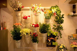 |  |
FLORISTA, PUNE
Status- built
Location- Pune , Maharashtra Year-2017
No. Of days- 20
The interior of a 18m2 flower-shop in Pune, was an opportunity for us to react to the absolute uniformity of such shops. The highlighting part of the project was the challenge of the number of days the project was supposed be built in. The space previously had a two wheeler service shop with oil stained and damaged structure.
Another challenge faced during the project was converting a rough and ruggedly used shop into a decorated and charming flower space. An ideal Flower shop is a place where all the sensory organs are tried to be stimulated using constructs in design and decor. The shop is designed in such a way that the visitor is endowed to touch the flower to stimulate all their senses and why they need the perfect flower or bouquet for every occasion.
To skillfully accommodate all the variety of articles required to run a flower shop in such a small space was our primary challenge, we have used some utilitarian and coloring strategies which also made the space look bigger. At the front: the large glass facade floods the space with natural light and the recessed doorway is created for comfortable entry to the main area of the store. As we enter the shop a part of mezzanine floor is used for display. Where the mirror in the back of the furniture upgraded the pieces and increases the visual expanse and extravagance of the space.
Inside the shop we can experience natural veneer finish furniture adorn the light colored walls which ensues contrast. The furniture is intended to compliment the color of floor and wall creating an alleviating effect. Glass shelves are fixed on the side walls in a planned grid to break the monotony which provides different level for displaying items (as shown in the image). On the side wall a wire mesh panel is created to hang flowers which creates beautiful cluster visual of flowers on sale.
Since its facing the main road , it was important to get all the artistic inputs inculcated in the design process. So as to conclude , this project was intended to create an out of the box , extraordinary space to make it the first well designed flower store in Pune.
 |  |  |
|---|---|---|
 |  |  |
 |
MASEMARI CHINJABI RESTAURANT
Area: 4000 sq.ft.
Year: 2014
Cost Of Execution: 150 Lakh Rs/- Days executed in- 55 nos.
A Fine Dine located in the heart of the bustling Bavdhan, bang on the main road, designed with a concept of creating a friendly relaxing space for all age groups. ‘The best way to somebody’s heart is through his stomach’ – This phrase has been proved true for the proud owners of this restaurant with eminent theatre and cinema personalities visiting them on a regular basis along with various food lovers of the city. Exhaustive study was done prior to the designing of this restaurant with respect to the visitor typology, requirements of the visitor’s taste, type of design suitable for all age groups, anthropology and experiential behavior. This helped the owners, not only from the perspective of promoting the eatery but each bit of design aspect contributed to the success of the project’s investment. This is observed when many passersby have been attracted by the grand entry of a Gabion wall on one side and exposed brick wall on the other with a fleshless fish directing you inside. The main entry of the indoor space, led by black granite steps, is adorned by crafty fish Jali patterns giving an ethnic and warm welcoming look to the visitor.
The outdoor seating area is placed amidst lush greenery with potted plants and trees. The restaurant lives up to its name by setting up the perfect mood for binging on the sea food served. The tube floats hanging by the walls, anchors suspended over the seating, artificial coconut shaped artifacts hanging on to the potted trees add to the beauty of the outdoor ambience. While planning the restaurant which was to occupy a carpet area of 4000 Sq. Ft., the prime consideration was to ensure that the design is in conformity with the principles of Vastu Shastra. The layout of the restaurant is configured in a linear confirmation segregated with two seating zones, such that the southern side is kept heavy by raising one step raised in stone forming a platform. The bar is aligned on a corner of that zone, setting up a lounge character, complementing the overall design. The zones though segregated by its planning, flow in a continual pattern uniting the entire room space as one. While one zone has a clean finish with plush seating, white ceiling, bright lighting, concealed services and rustic texture to the floor, the other zone has an informal feel to its formal seating.
The black painted exposed AC ducts act as ceiling giving it a functional depth and suspended decorative ceiling lights brighten up the space. In the midst of the mundane services is an Ochre feature wall with clay pats on them giving it a fresh look altogether. The design affords a maximum view of the outside greenery and also draws maximum natural light within minimum openings. Considering the large volume, the AC duct system was introduced to allow maximum intake of filtered fresh air towards generating an odorless environment. Selection of easy-to-maintain products and materials was a positive catalyst towards the future maintenance. Acoustics for the ceiling were carefully introduced to reduce noise ratio for a superior ambience. The North side is kept lighter with wider openings and white marble introduced along with white walls.
The water feature marks its pleasant presence in the North-east while the services are placed in the south west. With the successful venture of the restaurant, the owners experience zero maintenance issues, thus reducing the overall future cost. Overall, the project can be termed as an exploration of surfaces and colors that promulgated a cool social interaction and contrived the entire project with a lightning speed of exactly 55 days and further more reducing the maintenance sot with zero maintenance issues from the owners’ end.
Thus, the rigorous efforts put in by Ogling Inches has made a brand statement along with fulfilling the commercial investment of the owners to their heart’s content.
 |  |  |
|---|---|---|
 |  |  |
JOVOS 2.0
Hip Lounge
HOLY NAILS - NAIL SPA
location- Baner, Pune
Status- Completed
Location- Pune, Maharashtra
Year-2018
“Who better than Legorreta to get an inspiration from, for a space that majorly deals with colours?”
Ricardo Legorreta, an architect whose work was boldly modern yet deeply influenced by the traditional architecture of his native Mexican roots. Legorreta’s work is famous for his cubic structures with stucco walls, prints of rich, earthy reds, coppers and oranges, bright yellows, purples, and pinks. As we mentioned the inspiration behind HolyNails’ design is primarily Legend Legorreta’s work, you will find the same color tones & striking bold prints in this project.
With a dauntless red ceiling and distinctive furniture design, the space’s interior are intended to create a curiosity to the passer-by. Completed In a restricted timeline (A record duration of 12 days for us)and limited budget, the floor layout was strived to give the maximum circulation space for various salon activities.
Memphis inspired wallpaper at the entry is a melange of complex geometry and colour. A vibrant ‘mesh frame’ on the adjacent wall, pinned with dainty little wood pins is embracing the wallpaper phenomenally & also exhibiting the salon's art work at the same time.
Talking about the functionality of the space, customers for a pedicure are pampered in a blue armchair on a raised platform, surrounded by a pleasant ambiance. Whilst for manicure we have exclusively designed stations with arched metal frames that suspend cylindrical brass lamps & adequate light required for a detailed nail design process. A curvilinear, beige sofa is placed to comfort the customers in waiting, with a grand view of the overall space. even the customers in queue can enjoy the place by glaring at the enticing wall art and vivid decor due to a wholesome view of the spa.
Well! The customers of the space are going to have an utterly unprecedented experience at the spa. This project surely brings an evolution to the ‘Nail Parlour design’ by incorporating some unafraid choices & not following the cliche vibes of a Nail salon.
 |  |  |
|---|---|---|
 |  |  |
 |